For my viewer’s choice visualization I decided to choose a visualization that was pertinent to my current situation.
The visualization is an interactive website that helps you decide whether it is better to rent or to purchase a residence.
The data is simply numerical values that represent all of the possible costs to purchasing property.
The same cost calculations could probably be handled in a simple spreadsheet application, like Excel, but it is the visualizations interactive sliders and graphs that help this visualization stand out.
Website Link: http://www.nytimes.com/interactive/2014/upshot/buy-rent-calculator.html
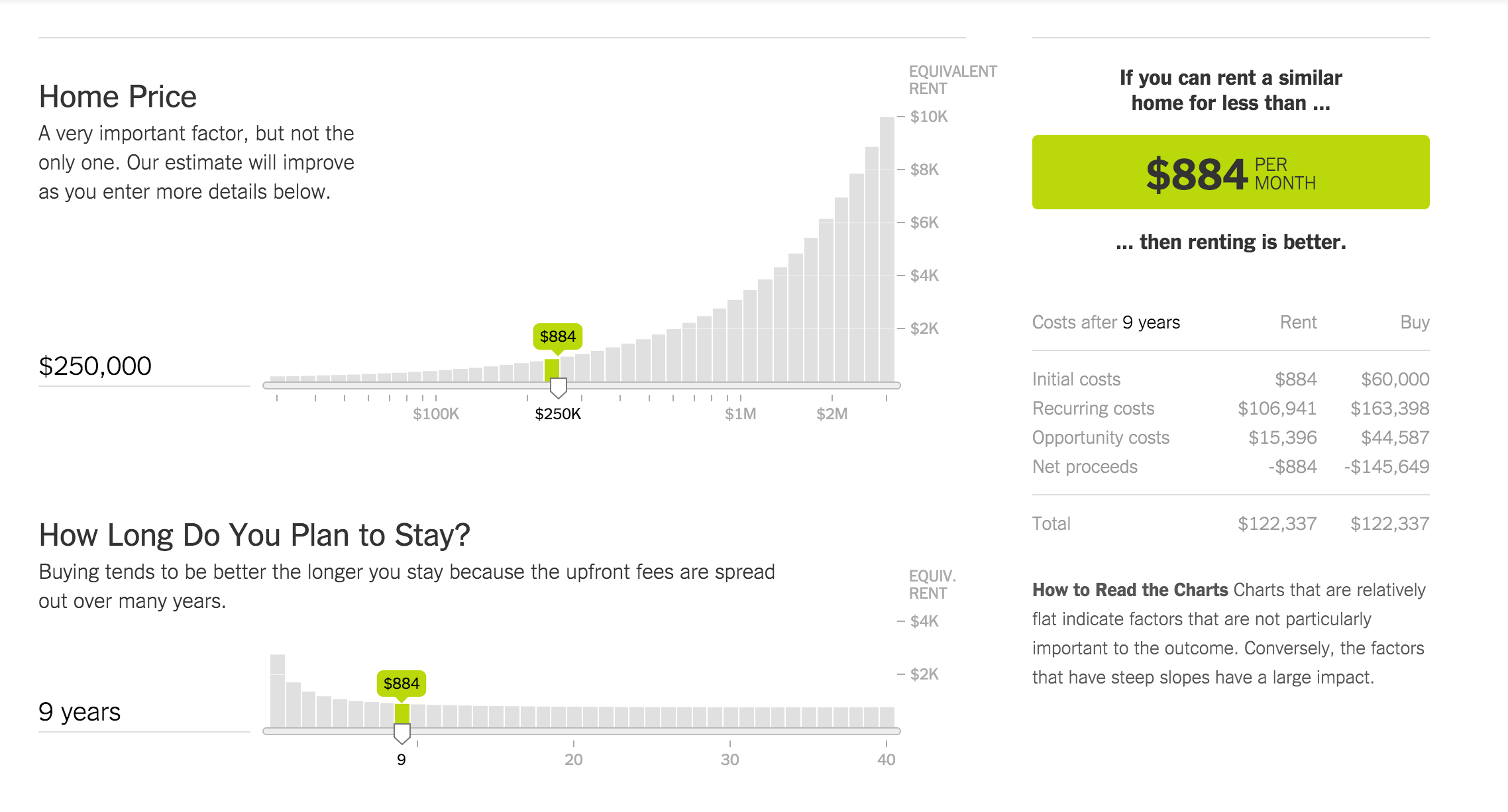
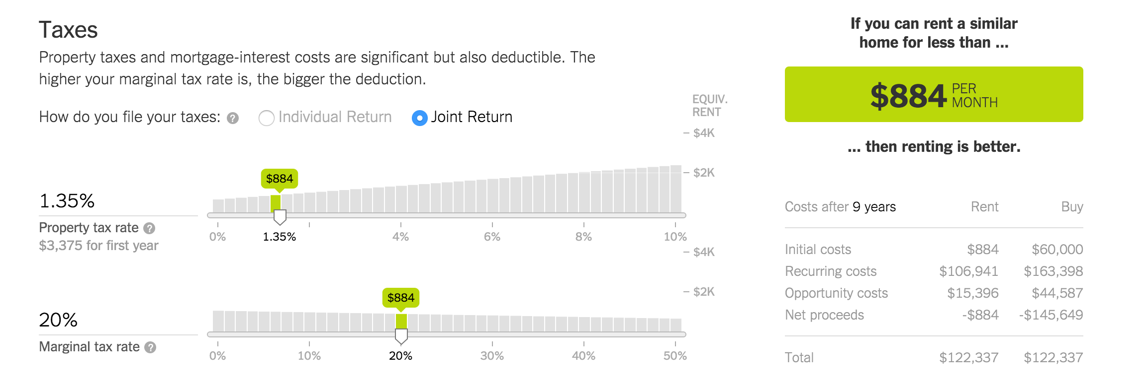
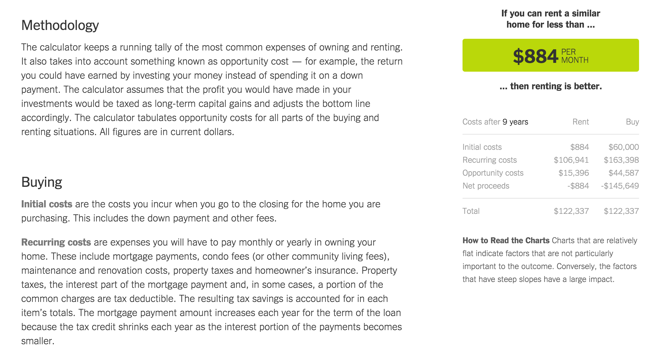
The first thing that stands out on the website is the color scheme. It relies on a very simple white/grey with black text and only uses the green color when it comes to showing the important price data and slider data.
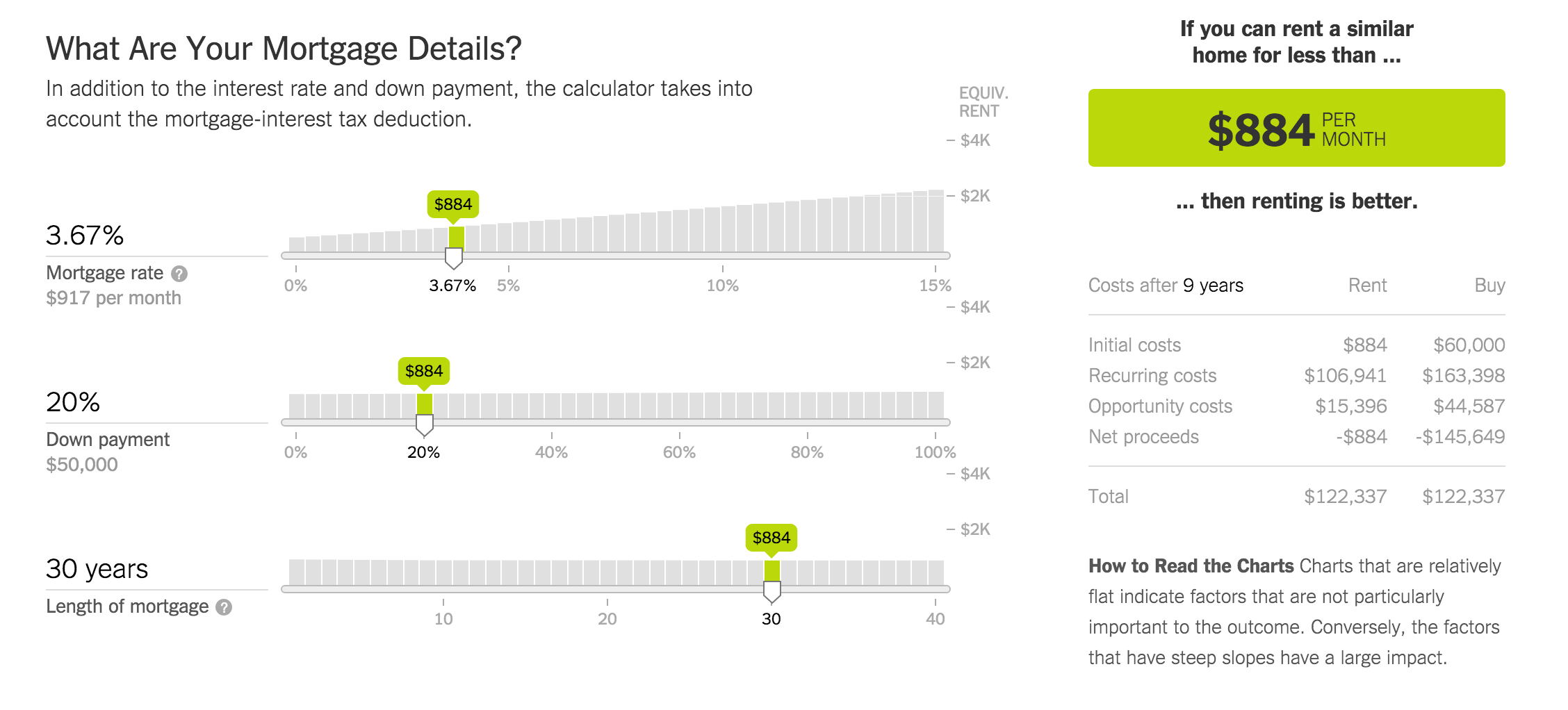
The default slider settings give us a total rent value of $884/Month as the maximum amount we should pay in rent for a comparable residence.
The first two sliders are simple in order to get the user acquainted with the interaction. "Home Price" and "How Long Do You Plan to Stay?" are simple bits of information that almost anyone should be able to fill out.
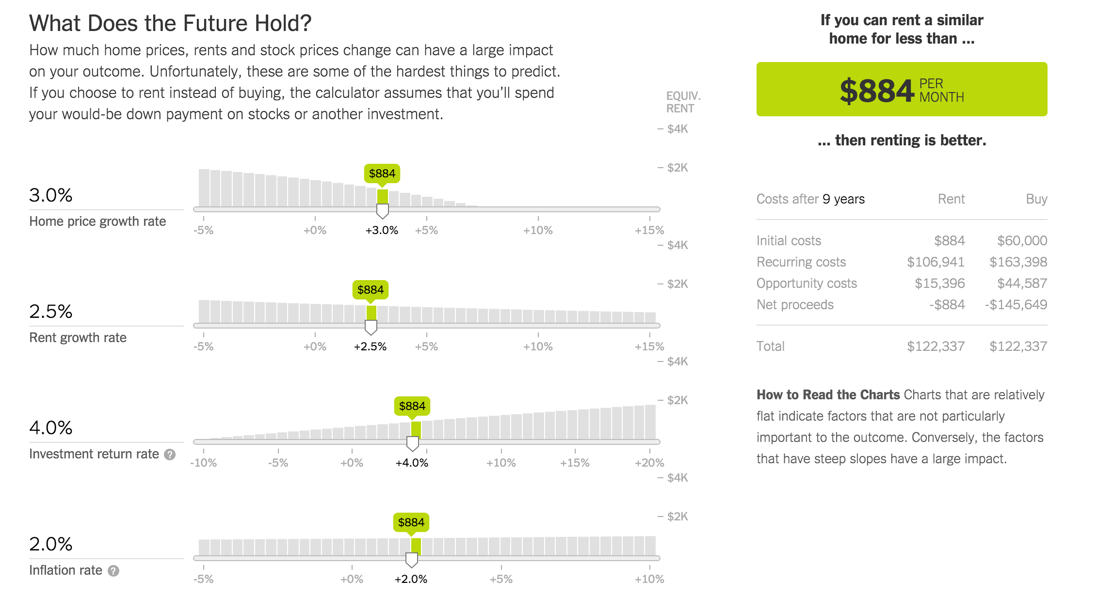
As we get lower on the page, the information becomes a little more interesting. "What Does the Future Hold?" is well described by the creator of the visualization as the hardest part of using the visualization. Although the interaction has not changed at all, the amount of knowledge that a person must have has increased.
As a potential first time buyer this section is honestly over my head. It may also be over the head of many younger people who would be first time buyers.
More experienced buyers and renters may not have much of an issue with this section, but at that point they may not really need the visualization at all. Which feeds into the question of "Who is this for?".
I believe that the answer is simply that this interactive visualization is for anyone that is relatively new to the process. Although this section is hard to figure out, the fact that there are starting values allow for an inexperienced person to leave this section alone with the understanding that this is simply an estimated value of total price equivalence.
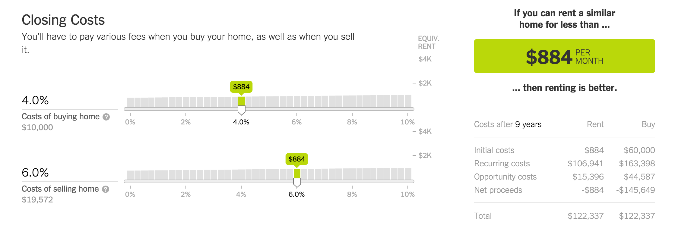
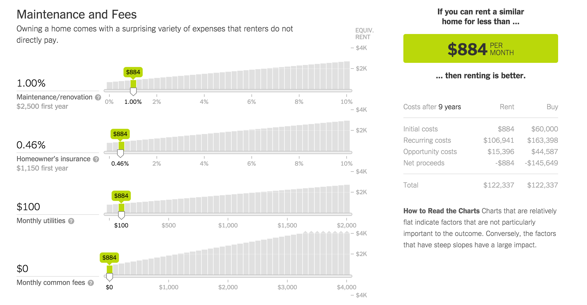
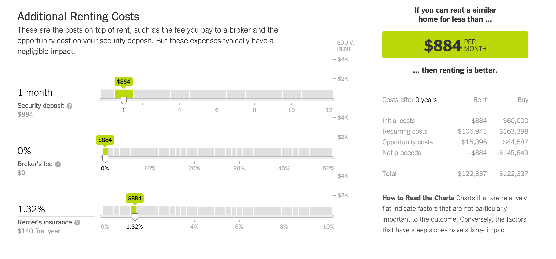
Something I noticed, and I'm sure is obvious while reviewing the screenshots I took, is that the section on the right scrolls with the user as they interact with the visualization.
The exceptions to this are at the very top of the page where the user reads the introduction paragraph, and the very bottom of the page where there are links to other articles.
I personally like this feature as it ensures that the user has the pertinent information (or goal) as they make changes along the way.
The final section of the website is some description of how the visualization works and how some of the selections above are calculated into each section.
I did not screenshot all of the information at the bottom of the page, but it can be seen by visiting the visualizations main site.
Likes:
Simple color scheme makes sure that the interactive and important information are highlighted.
Very simple to use as it only requires a click and a drag to interact with each section.
Very informative. My fiancee and I used it to decide on renting vs buying.
The conclusion section scrolls with you.
Each section has a decent explanation of the following sliders.
Dislikes:
The color scheme may be a little too simple, in that the majority of the page seems boring.
To complete the process it requires a little bit of a time dedication as there are lots of interactive sections.
To be fully effective the user must have an established knowledge.
Ultimately I feel that this visualization is useful for the users that are willing to invest a little time to research the appropriate values.
I feel that it could be improved if the sliders started at expected values based on another sources data. But that may require giving control of the visualization to a financial institute, who may benefit more from people buying instead of renting.